
The 3 Basic Font Types and What They Tell Us About Your Identity
It may seem like a pretty minuscule thing to think about, but a brand’s font choice says as much about them as their colors and logo. For some, picking a font doesn’t seem that important. Most people only pick fonts when they’re writing a word document and it usually doesn’t matter (unless you’re writing something academic, then everything is New Times Roman, 12-point font all the time). Looking at it from a designer perspective, font choice defines a brand in ways most don’t think about.
Serif Fonts
These are seen most often in books and other large blocks of text, especially in print. When most look at these types of font, they think about credibility because it’s so heavily associated to academia. These fonts typically say a brand is classic, traditional, and trustworthy. Many higher-class brands such as Time Magazine and Vouge use serif fonts like Didot and Proforma.
Sans-Serif Fonts
Modern and minimalist brands choose sans-serif fonts because they’re clean and communicate sensibility and honestly to the viewer. Brands such as Jeep and Target use Helvetica, one of the most popular sans-serif fonts. Theses fonts are actually the easiest for people to read on digital platforms and online articles.
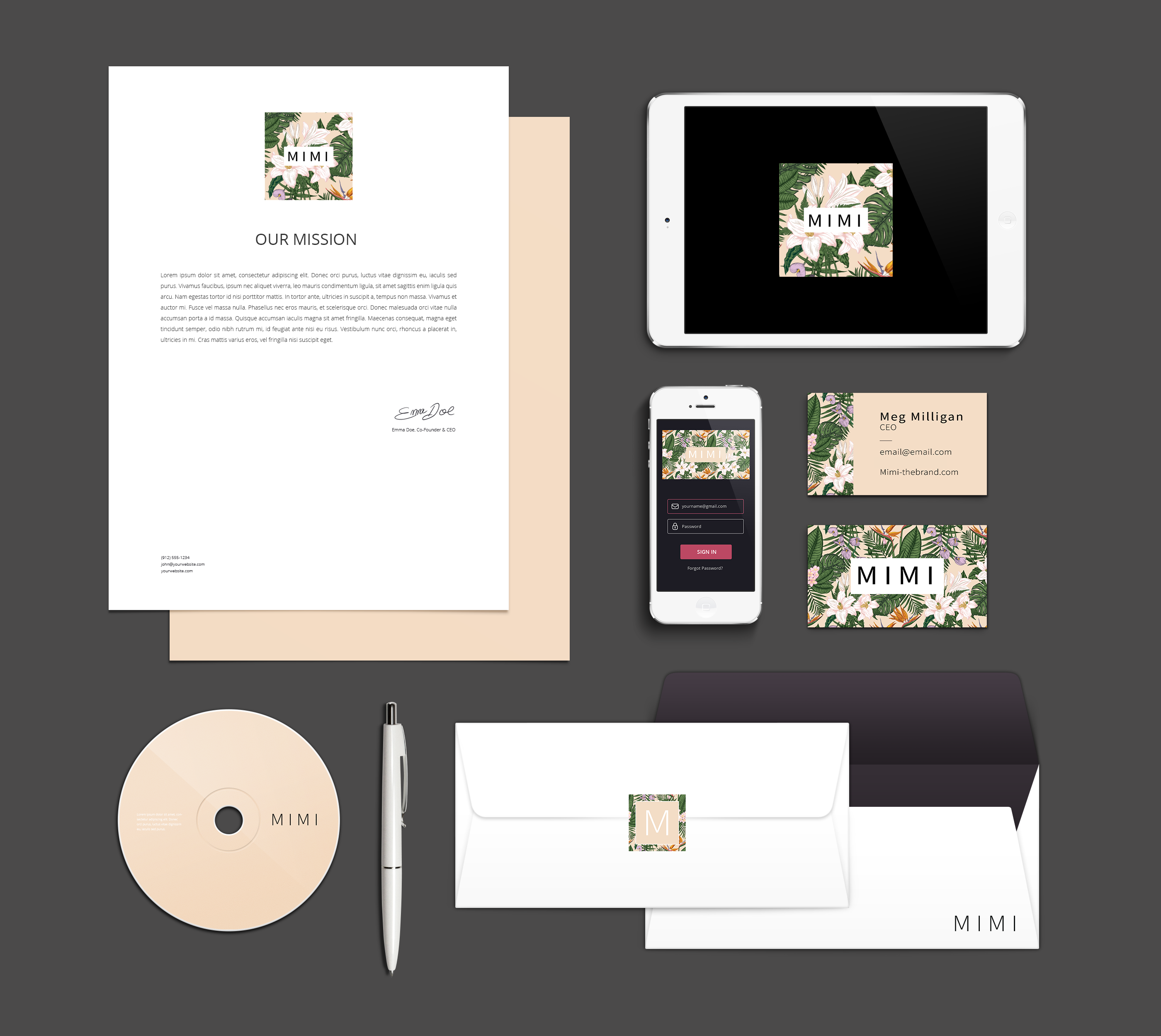
Script Fonts
Script fonts closely remember calligraphy and are perceived to be even fancier than serif fonts. Brands choose these fonts because they are perceived as elegant, feminine and creative. It’s a font style that closely resembles nice handwriting and is used to give brands more personal touches. Picking a legible script font is extremely important but could be easier said than done. It’s highly encouraged to use a secondary font with script fonts to avoid legibility issues. One of the most well-known brands, Coca-Cola, uses the script font Spencerian Script.
Fonts are closely tied to a brands identity and are used just as much if not more than the actual logo itself. It’s important to sit and comb through all the options available before settling on a font because it goes well with the other elements. Sit back and take a minute to evaluate why it goes well with everything and what kind of emotions it evokes.
Sources:
https://www.adweek.com/digital/choose-your-fonts-wisely-to-maximize-credibility/
https://www.nytimes.com/2018/04/01/business/media/advertising-fonts.html?searchResultPosition=10
https://www.huffpost.com/entry/never-use-futura-fonts_n_59dfe171e4b0a52aca16b3a5